What Makes an Interior Look Luxury? (Designer Secrets Explained)
Quick Answer: Luxury interiors are defined by material quality, lighting layers, spatial restraint, and a controlled color palette — not by how much money was spent. Understanding these principles means you can apply them in any space, at any budget.
It's Not About the Price Tag
Ever walked into a space and instantly felt like it looked expensive — without knowing exactly why? That feeling is more common than people realize, and the reason for it is almost never what you'd expect.
It's not the square footage. It's not the brand names on the furniture. It's not even the renovation budget — though that helps. The spaces that genuinely feel luxurious tend to share a small set of design principles that work quietly in the background, shaping how the room feels without announcing themselves.
Once you know what those principles are, you start seeing them everywhere. And more usefully, you start knowing how to apply them — even in spaces where the budget is tight and the bones are imperfect.
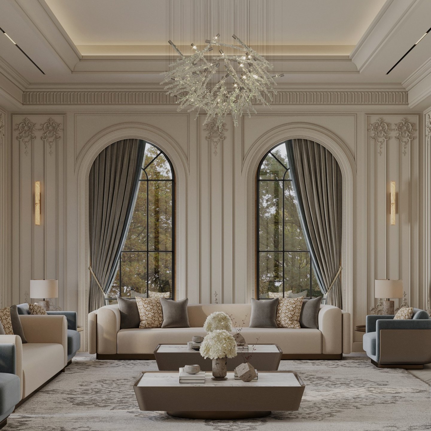
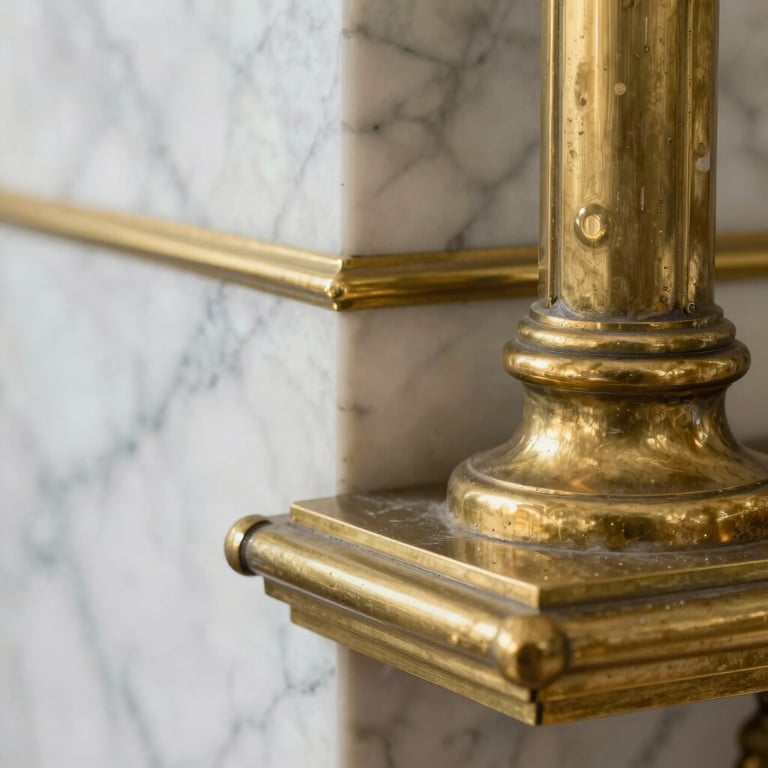
1. Materials That Age Beautifully
The single biggest difference between an average interior and a high-end one is usually what you can see and feel underfoot, overhead, and in your hands. Luxury interiors are built from materials that have depth — natural surfaces that change slightly with time and light, that develop a quality you can't fake.
The materials that consistently elevate a space:
• Natural stone — marble, travertine, limestone. Even a single travertine side table transforms a room
• Solid wood — oak, walnut, teak. Avoid veneers and anything that looks uniform from across the room
• Linen, wool, velvet — textiles with texture and weight, not synthetic smoothness
• Aged metals — brushed brass, matte black, unlacquered bronze that will patina over time
The good news: you don't need to replace everything. Even one upgrade — swapping a glass coffee table for solid stone, or replacing synthetic cushion covers with linen — shifts the atmosphere of a room in a way that's immediately felt by anyone who walks in.
2. A Color Palette That Doesn't Try Too Hard
One of the most reliable tells between an amateur interior and a professionally designed one is what happens with color. Not which colors were chosen — but how many, and how confidently they were used.
Luxury spaces don't rely on bold statements or on pulling colors from every corner of the wheel. They use layered neutrals with depth — tones that shift slightly depending on the light, that create a sense of calm and coherence throughout the space.
A few palettes that consistently read as expensive:
• Warm white, greige, and deep forest green
• Soft beige, ivory, and brushed brass
• Charcoal, off-white, and warm leather tones
The rule is simple: stick to a cohesive palette and repeat it throughout the room. Too many colors reads as visual noise. Controlled tones read as intentional. And intentional always looks expensive.
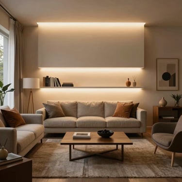
3. Lighting — The Most Underestimated Element in Any Room
If there is one thing that separates a space that looks designed from one that doesn't, it's the lighting. Not the fixture — the approach.
Luxury interiors never rely on a single ceiling light doing everything at once. They layer light across the room at different heights and for different purposes, creating atmosphere that shifts the space from functional to genuinely beautiful.
The three layers every room needs:
• Ambient lighting — the general fill that replaces the single overhead fixture
• Task lighting — focused light for reading, working, or preparing food
• Accent lighting — directional light that highlights art, textures, and architectural details
💡 Use warm bulbs at 2700K to 3000K, and install dimmers on everything you can. The difference between a room at full brightness and the same room at 60% with warm light is extraordinary. It's the fastest transformation available to any interior.
4. Furniture — Fewer Pieces, Better Choices
The instinct when furnishing a room is often to fill it — to add one more chair, one more side table, one more piece of decor until the space feels complete. In luxury design, the thinking runs in precisely the opposite direction.
Overcrowded rooms feel chaotic regardless of how expensive the individual pieces are. The spaces that read as genuinely high-end are the ones where each piece has been chosen carefully and given room to breathe.
What makes furniture look expensive in practice:
• Correct scale — pieces that are slightly larger than expected feel more substantial and grounded
• Visible legs — furniture on legs (wood or metal) feels lighter and more considered than pieces that sit directly on the floor
• Clean upholstery — structured cushions and tailored fabric, not cushions that collapse when you sit
• Arrangements that leave space — furniture that's slightly away from the walls, with breathing room between pieces
5. Space Itself Is a Design Element
Here is something most designers know but rarely say out loud: empty space is part of the design. The gaps between furniture, the clear floor areas, the walls that aren't covered — these are active choices, not omissions.
Luxury interiors feel expensive in part because they allow the room to breathe. They resist the urge to fill every corner, hang art on every wall, or place something on every surface. The restraint is intentional, and it creates a calm that money alone can't buy.
Practical ways to apply this:
• Leave at least 40 to 50 cm between pieces of furniture
• Resist pushing everything against the walls — floating furniture reads as more intentional
• Use one large plant instead of several small ones
• Clear one surface completely before adding anything decorative to another
Quick Changes That Make an Immediate Difference
You don't need a full renovation to upgrade how a space reads. These changes consistently have an outsized impact relative to their cost and effort:
• Hang curtains from ceiling height, not from above the window frame — it adds the illusion of height to any room
• Replace multiple small art pieces with one large-scale work that commands the wall
• Upgrade hardware — handles, knobs, and fittings are the jewelry of a room, and quality shows
• Reduce clutter by 50 percent. Then reduce it a bit more
• Switch to a single large area rug rather than multiple smaller ones — the most common layout mistake in residential interiors
Common Mistakes That Make Spaces Look Cheap
Fixing mistakes is often faster than adding new things. These patterns appear regularly in spaces that don't quite read as designed:
• Everything matches too perfectly — a luxury space has mix, tension, and some unexpected element
• The rug is too small — it should be large enough that at least the front legs of every piece of furniture sit on it
• A single ceiling light source doing all the work
• Art hung too high — the centre of any piece should sit at eye level, roughly 145 to 150 cm from the floor
• The ceiling treated as neutral space — a considered ceiling color, architectural detail, or statement fixture transforms a room
Frequently Asked Questions
What makes a home look expensive?
Quality materials used with restraint, a controlled color palette, layered lighting, and furniture that fits the scale of the room — applied consistently throughout the space.
What colors look most luxurious?
Neutrals with depth: warm whites, greiges, stone tones, and deep anchoring colors like forest green, charcoal, or warm terracotta. What they have in common is that they read differently depending on the light, which gives them a richness that flat bright colors don't have.
Is luxury interior design always expensive?
No — and some of the most effectively designed spaces are proof of that. Luxury is a design language, not a price point. The choices that make a space feel expensive — restraint, quality in a few key materials, layered lighting — are available at almost any budget if you prioritize correctly.
Final Thoughts
Luxury interior design comes down to a small set of principles applied consistently: material quality where it matters most, lighting that works in layers, a palette that holds together, and enough empty space for the room to breathe.
Start with one of these. Fix the lighting if you haven't. Swap one synthetic material for a natural one. Clear a surface that's been accumulating things for months. Each change reinforces the others, and the cumulative effect is a space that feels genuinely different — more considered, more calm, more expensive than the sum of its parts.
Browse mood boards and AI-generated interior concepts on Chicspaces — curated by a professional interior designer.

Chicspaces
Design faster without designing less.
Navigate
Home
PORTFOLIO
SERVICES
PROMPT LIBRARY
SHOP
BLOG
Get in touch
Support available Mon–Fri, 9–6 ET
Remote-first — serving designers worldwide