Why Your 3D Renders Look Fake and How to Fix Them
Your 3D renders look fake because of 6 fixable mistakes — wrong lighting, flat materials, bad camera settings. Here are the exact fixes every designer needs.
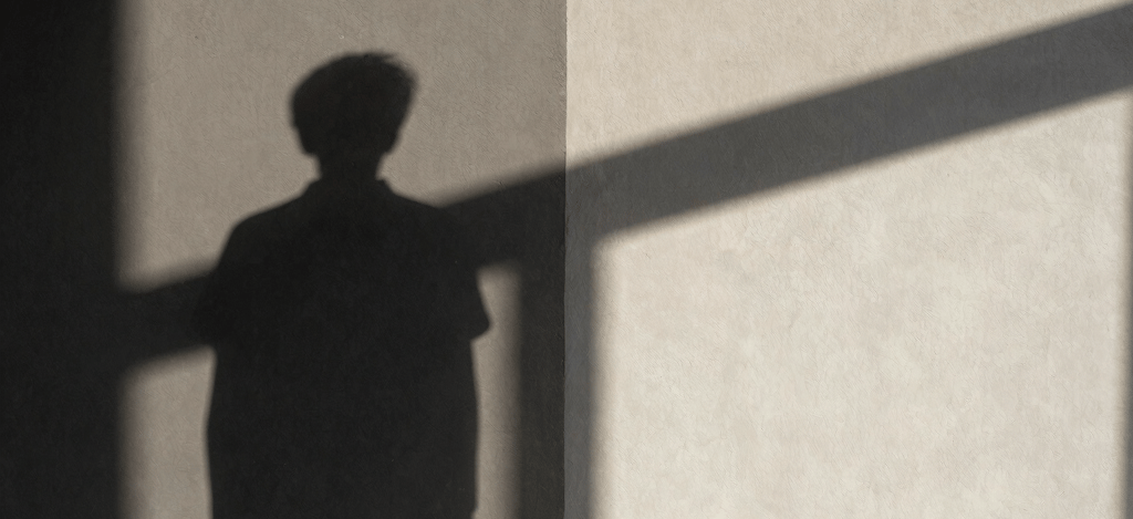
You have spent hours building the model. The geometry is clean, the furniture is placed, the camera angle is good. Then the render comes back and something is wrong. The room looks like a render, not a room. The materials look like plastic. The light looks like it is coming from nowhere in particular. The shadows are either too sharp or completely absent.
This is one of the most common frustrations in architectural visualization, and it happens to designers at every level. The good news is that fake-looking renders almost always come from a specific set of identifiable problems — and every one of them has a fix.
This article goes through the main culprits one by one, with the exact settings and logic behind each fix. The examples are based on Corona Renderer in 3ds Max, but the underlying principles apply to any production renderer.
Problem 1: The Light Has No Source
The single most common reason renders look fake is unphysical lighting. The scene is lit, but the light does not appear to come from anywhere real — no windows casting directional beams, no lamps creating pools of warm light, no clear relationship between where the light sources are and how the room is illuminated.
This happens when designers rely on ambient light or a generic HDRI without adding any specific light sources tied to the architecture of the space. The result is a room that is evenly bright everywhere, which is precisely how no real room looks.
The fix: remove all ambient and fill lighting first. Then light the scene only from sources that exist in the actual space — windows, ceiling fixtures, floor lamps, wall sconces. If a corner is too dark after doing this, do not add a fill light. Instead, increase the light coming through the window or add a lamp that logically belongs there. Every light source should have a physical reason to exist.
A good test: if you cannot point to where every light in your render is coming from, your lighting is not physical. Start over with sources only.
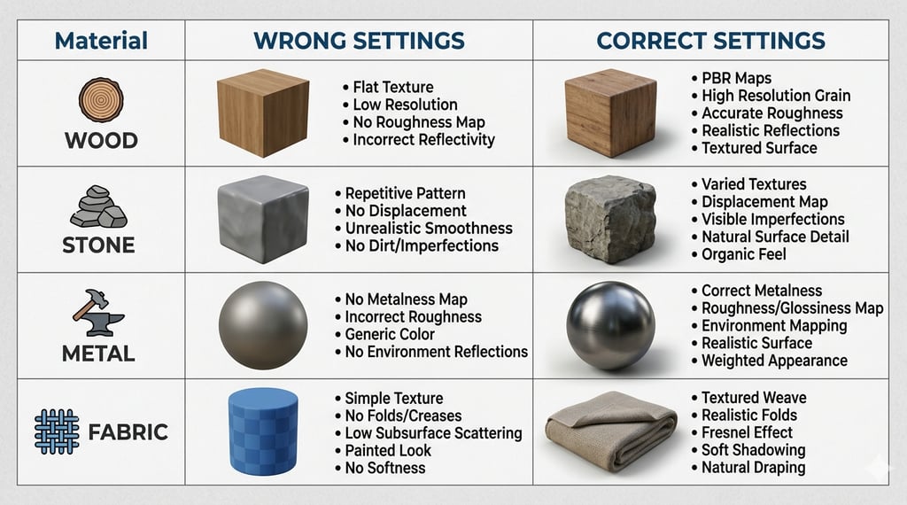
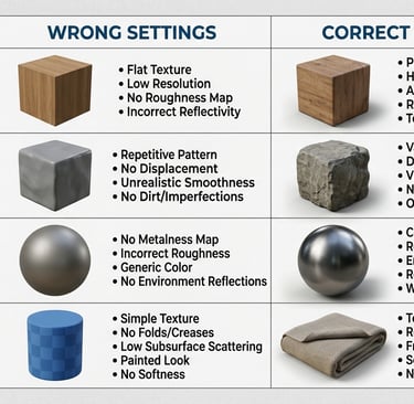
Problem 2: Materials Have No Depth
Flat materials are the second fastest route to a fake render. This usually comes from one of three sources: diffuse textures without any surface variation, reflectivity values that are either zero or set uniformly across the whole surface, or missing bump and displacement maps.
Real materials are never perfectly uniform. A painted wall has micro-texture. A stone floor has variation in polish across its surface. A fabric sofa has areas of compression where the cushion meets the frame. None of this has to be modelled geometrically — it needs to be communicated through maps.
The specific fixes by material type:
• Walls and plaster: add a subtle bump map with a low-frequency noise pattern. Roughness should sit between 0.6 and 0.8. A very slight warm tint in the diffuse channel (never pure white) makes painted walls read as real.
• Stone and tile: use a high-resolution diffuse map with a separate glossiness map so different areas of the surface reflect differently. Grout lines should have their own bump value, slightly recessed. Reflection IOR between 1.5 and 1.8 for polished stone.
• Wood: the grain direction of the texture must follow the geometry of the object. A wood floor with grain running across the boards breaks immediately. Add a subtle scratching layer in the bump channel for used wood, or a very slight sheen variation for new wood.
• Fabric: fabric almost never reflects. Roughness values of 0.9 to 1.0. What makes fabric look real is the bump map simulating weave, and a very subtle subsurface or translucency value for thin fabrics like linen.
• Metal: the most common mistake is using a fully reflective metal with no roughness. Real metal is never perfectly polished unless it has just been machined. Aged brass should sit around 0.3 to 0.5 roughness. Brushed steel around 0.4 to 0.6 with anisotropy applied along the brush direction.
Problem 3: The Camera Settings Are Wrong
Most visualization problems blamed on lighting or materials are actually camera problems. The physical camera in your renderer controls exposure, white balance, depth of field, and lens distortion — and wrong values in any of these will make a render look artificial regardless of how good the lighting setup is.
The most common camera errors:
• Exposure too high or too low: overexposed renders lose material detail and contrast. Underexposed renders look grey and flat. Use the histogram in your render viewport to target a balanced exposure with detail preserved in both highlights and shadows. For interiors, a typical starting point in Corona is EV 10 to 12 with a daylight setup, adjusted to scene.
• White balance set to neutral: a neutral white balance makes renders look clinical. Real interior photography almost always has a slight warm cast because interior light sources are warm. Set your white balance to 5500–6500K for a daylit interior and drop it to 3200–3500K for an evening scene with artificial light. The room will immediately feel more inhabitable.
• No depth of field: renders with everything in perfect focus look like technical drawings, not photographs. Real lenses cannot hold focus across the full depth of a room. A subtle depth of field with focus on the primary focal point of the scene adds photographic credibility without blurring anything important. F-stop between 5.6 and 8 for a wide interior shot.
• Lens distortion absent: real wide-angle lenses distort slightly at the edges. A small amount of barrel distortion (1 to 3%) added in post makes renders read as photographed rather than rendered.
White balance is the fastest single fix for a render that looks cold and fake. A shift from 6500K to 5200K takes thirty seconds and changes how the entire scene feels.
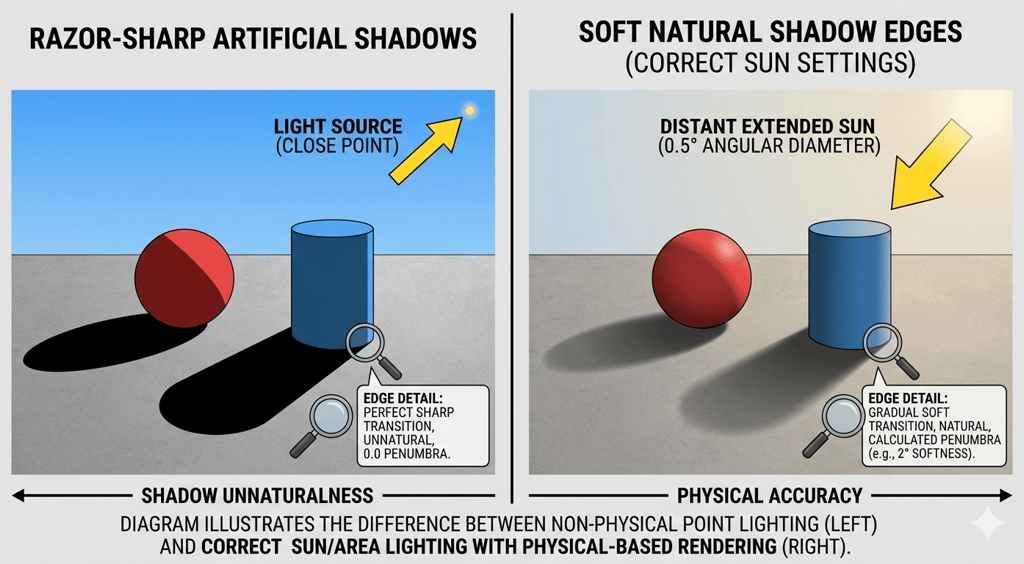
Problem 4: Shadows Are Wrong
Shadow problems come in two forms: shadows that are too hard and shadows that are absent. Both break photorealism immediately.
Hard shadows come from light sources that are too small relative to the scene. The sun through a window does not produce a razor-sharp shadow edge in a real room — the light is diffused by the atmosphere, by the glass, and by the size of the opening. In your renderer, increase the size of your sun light source and make sure your sky model is active. Corona Physical Sky with the sun size multiplier at 3 to 5 produces soft, realistic shadow edges that match what a camera would actually capture.
Absent shadows are usually a GI problem. If the global illumination bounces are too low, dark areas fill in unnaturally. For interior scenes, set primary GI to Path Tracing and secondary to UHD Cache or Path Tracing. Minimum 3 GI bounces, ideally 5 to 8 for scenes with complex light paths — furniture-filled rooms, rooms with indirect light through doorways, or any scene with a chandelier or pendant fitting.
Problem 5: The Scene Has No Imperfection
Perfect scenes look fake because reality is not perfect. A room where every surface is pristine, every object is exactly placed, and no material shows any age reads as a showroom rather than a home.
This does not mean making your scenes look dirty. It means introducing the micro-imperfections that tell the eye it is looking at something real:
• Fingerprints and smudges on glass surfaces: a subtle grunge map in the roughness channel of glass makes it read as real. Perfectly clean glass is physically implausible in an inhabited space.
• Slight misalignment in objects: cushions that are not perfectly centred, books at slightly different angles, a rug edge that does not run perfectly parallel to the wall. These take thirty seconds each and completely change the reading of the scene.
• Material wear at edges: a chamfer map or edge wear mask applied to wood furniture, giving slightly lighter edges where the finish would naturally wear, transforms the material from digital to physical.
• Variation in artificial light colour temperature: if your scene has multiple light sources, they should not all be the same temperature. A ceiling fitting at 3000K, a floor lamp at 2700K, and daylight at 5500K through the window creates the layered, warm quality of a real room at dusk.
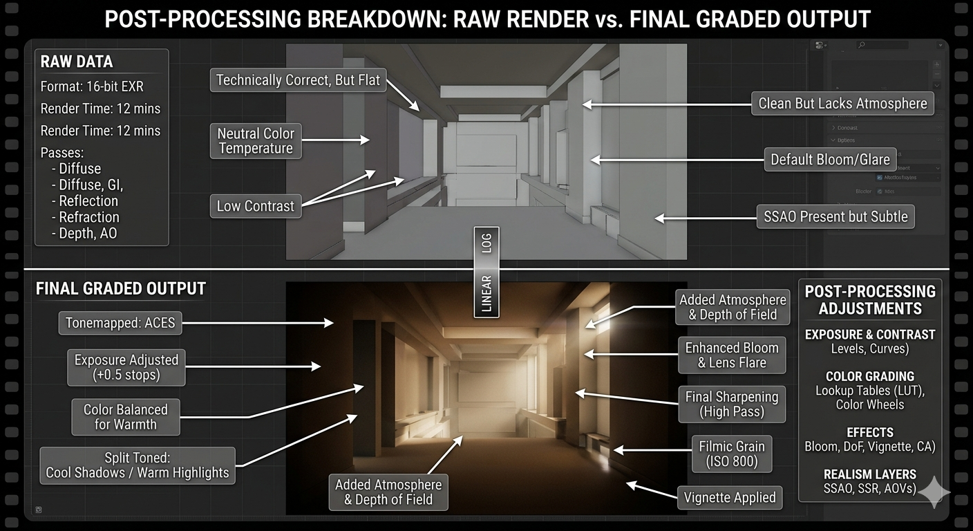
Problem 6: Post-Processing Is Either Missing or Overdone
The gap between a good render and a great render is almost always closed in post-processing. But post-processing is also where renders go wrong when it is applied without restraint.
The goal of post-processing is to match what a camera would have captured, not to create a look that could not exist photographically. This means:
• Colour grading: a very slight lift in shadows (raising the black point by 5 to 8%), a warm push in midtones, and a slight desaturation in highlights. This matches the tonal response of real camera sensors and removes the slightly raw look of an unprocessed render.
• Bloom and glare: small amounts of lens glare on light sources and bright reflections. The operative word is small. A glare effect that is visible at normal viewing distance is too strong.
• Chromatic aberration: a 1 to 2% chromatic aberration at the edges of frame adds photographic realism. More than this looks like a visual effect.
• Sharpening: a moderate unsharp mask or clarity adjustment brings out material texture. Over-sharpening creates halos around edges and makes the render look processed.
The test for post-processing: show the final image to someone unfamiliar with visualization. If their first comment is about the post-processing rather than the design, it is overdone.
The Checklist: Before You Send Any Render
Run through these before any render leaves your hands:
• Every light source has a physical location in the scene
• White balance is set to match the light sources present
• Depth of field is applied with focus on the primary focal point
• All materials have bump or displacement maps
• No material uses pure white, pure black, or 100% reflectivity
• Shadow edges are soft and directional
• At least three small imperfections are present in the scene
• Post-processing is applied and the result still reads as photographic
FAQ
Q: My renders take too long and still come back noisy. What is the fastest fix?
A: Noise in interior renders is almost always a light path problem, not a sample count problem. Before increasing render time, check that your windows are not blocked by geometry, that your light sources are visible to the camera (or have a clear path to the scene), and that your GI settings are using Path Tracing rather than Irradiance Map for scenes with complex light. Adding more samples to a scene with bad light paths just renders bad light paths more accurately.
Q: Should I use HDRI lighting or physical sun and sky for interiors?
A: Physical sun and sky for any scene where direct sunlight enters the space. HDRI for overcast or studio lighting conditions, or for scenes where the exterior view through windows matters. Combining both — physical sun and sky for the sun position, with a low-intensity HDRI for fill — gives the most controllable result for interior scenes with complex glazing.
Q: How do I stop my white walls from blowing out near windows?
A: This is an exposure problem, not a material problem. Lower your overall exposure until the wall near the window holds detail, then compensate for dark areas by adding interior light sources rather than raising exposure. Alternatively, use Corona's Light Mix to balance window light against interior sources after rendering, which gives full control without re-rendering.
Chicspaces
Design faster without designing less.
Navigate
Home
PORTFOLIO
SERVICES
PROMPT LIBRARY
SHOP
BLOG
Get in touch
Support available Mon–Fri, 9–6 ET
Remote-first — serving designers worldwide